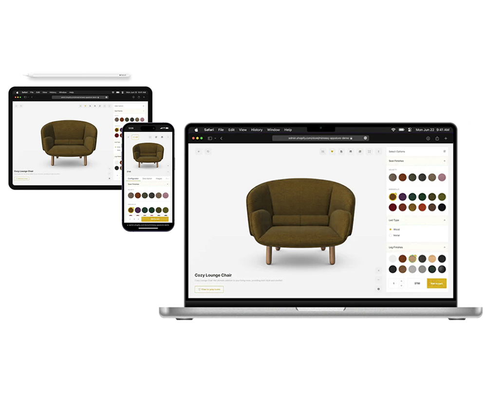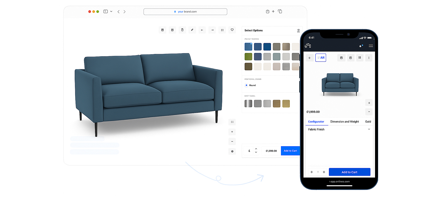
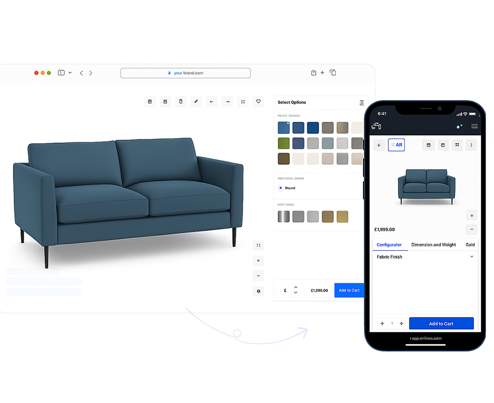
When a shopper spins a product, changes the colour, or drops it into their room with AR (augmented reality), it’s meant to feel simple. Behind the scenes, a lot has to line up so it “just works” on any phone, tablet, or laptop. Getting it right lifts sales and cuts returns across your eCommerce website.
Six principles for tech that actually helps people shop
One source of truth for the product and its options
- Bring specs, images, sizes, finishes and rules into one place so every channel shows the same reality. If a tap can’t take a certain handle, if size L needs a stronger frame, or if a laptop upgrade changes lead time, the system should know and guide the shopper without dead ends.
- What this means in practice: clear option rules, live price updates (including extras), and delivery dates that change honestly with each choice.
Realistic visuals, everywhere
- Shoppers make decisions with their eyes. Photoreal images, 3D and optional AR should show true colour, believable textures and correct scale. Whether it’s a sofa, a bike, trainers or a laptop. The goal is to close the “will it look right?” gap that normally forces a store visit.
- What this means in practice: tidy 3D files that load fast, lighting that avoids odd glare, accurate shadows in AR, and samples that match what’s on screen.
Speed and reach by default
- If pages lag, people bounce. The experience must be quick on older phones and solid on patchy Wi‑Fi. Accessibility isn’t an extra; keyboard controls, readable labels and motion settings should just work. Search engines reward this kind of clean build too.
- What this means in practice: small downloads, only loading what’s needed, clear page structure, and performance checked on real devices, not just designer laptops.
Seamless hand‑offs across the journey
- A configuration should travel with the shopper: from an ad or email to the product page, into AR, and straight through to the basket or into a store visit via a QR code. If they talk to support or a store colleague, that person should see the same saved build.
- What this means in practice: shareable links, saved presets, and store tools that can pull up the exact version the customer created at home.
Transparency builds trust
- People don’t mind choice; they mind surprises. Break down pricing clearly, show compatibility rules upfront, and display realistic delivery windows that update with each option. Add simple notes like “popular with this finish” instead of pushy nudges.
- What this means in practice: no hidden up‑charges, clear availability by region, and guidance that helps rather than hypes.
A feedback loop that respects people
- Use interaction data to improve the experience. For example, what colours get tried, which scenes drive add‑to‑basket, where people stall, while keeping privacy front and centre. Feed the signals back into buying and merchandising so stock follows real demand.
- What this means in practice: small tests (like swatch order), fewer returns because expectations match reality, and less waste from guessing.

Key Takeaway
Great visual shopping isn’t one trick, it’s a system. Most teams don’t have the time to build and maintain all of it. A platform like Morf brings the moving parts together so your store can offer confident, “try‑before‑you‑buy” experiences for anything configurable, without slowing down your website.